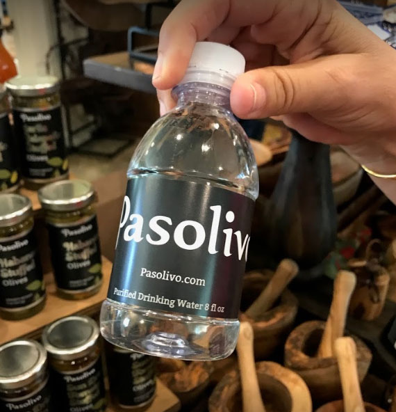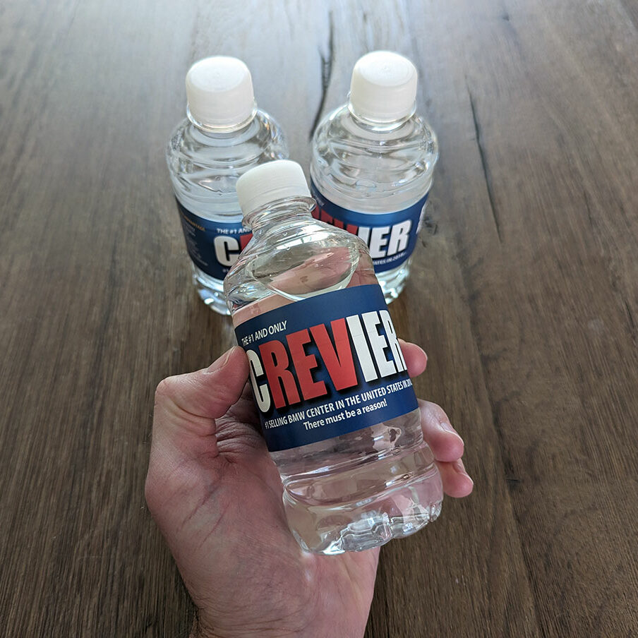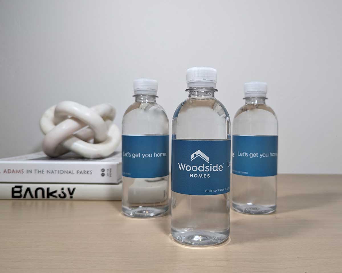
Custom bottled water labels serve as a vital marketing tool for brands looking to enhance their visibility and appeal to consumers. In the competitive landscape of bottled water, unique and eye-catching labels can significantly impact a product’s shelf presence. This is where private label bottled water shines. With advances in printing technology and design software, creating personalized labels is now more accessible, offering businesses the ability to tailor their branding to specific events, campaigns, or corporate identity.

Related Article:
Tips for creating an eye-catching custom water bottle label
When designing custom water bottle labels, simplicity is key. A clean and straightforward design ensures that the message is conveyed immediately.
Utilize bold fonts for the brand name to make it stand out, but avoid cluttering the space with excessive details.
Color selection is critical; it should reflect the brand’s identity while also providing a contrasting background for legibility.
An effective color scheme enhances brand recognition and draws the eye. Use complementary colors or those that align with the business’s color palette.
Incorporate high-quality images or logos that embody the brand’s ethos. These visuals act as a centerpiece for the label and should be sharp and easily identifiable.
Material and finish of the label play a significant role in its appeal. Consider using a waterproof and durable material that withstands condensation. A matte or glossy finish can also impact the tactile experience and visibility of the label.
The hierarchy of information is vital; place the most important details, like the brand name and logo, prominently. Below is an example of how to prioritize information on your label:
- Brand name/logo: Immediate recognition
- Product name: Identify the item clearly
- Tagline or message: Brief and memorable
- Ingredients or source: Transparency builds trust
- Contact details: For customer follow-up
The Role of Color Psychology in Designing Custom Bottled Water Labels
Color psychology plays a pivotal role in the marketing and aesthetic appeal of custom bottled water labels. When selecting colors for a label, one must consider the emotions and behaviors that colors are likely to evoke.
For example, blue is often associated with purity, calmness, and freshness, making it a popular choice for bottled water labels. It subconsciously suggests a natural and refreshing experience, aligning perfectly with what consumers expect from their water.
On the other hand, green conveys health and sustainability, potentially appealing to eco-conscious buyers. The use of green can indicate that the water is environmentally friendly or sourced responsibly, tapping into the audience’s environmental values.
White is another favored color as it symbolizes simplicity and cleanliness. It can help convey the product’s purity and high quality.
Contrastingly, using black on water labels might imply luxury or sophistication, targeting a market that’s looking for a premium hydration experience.
Specific colors can also encourage impulse purchases, especially when positioned amongst competing products. Bright and contrasting colors like red or orange can attract attention but are used less frequently to communicate the natural and calm connotations typically desired for bottled water.
Incorporating correct color combinations can create a visually appealing design that stands out while conveying the brand message. For instance:
- Blue and White: Imparting feelings of cleanliness and tranquility.
- Green and Brown: Suggesting an organic and earthy quality.
- Black and Gold: Hinting at exclusivity and premium positioning.
Related article:
How to incorporate your brand identity into custom water bottle labels
Incorporating brand identity into water bottle labels is essential for establishing a strong market presence and facilitating brand recognition. This involves careful consideration of the brand’s core values, a strategic use of visual elements, and a clear information hierarchy on the label design.
Brand Identity
Brand identity encompasses everything that represents a company’s image and values in the minds of consumers.
When considering water bottle labels, it is crucial to feature the brand’s logo prominently. The logo should be placed strategically where it catches the eye immediately.
Additionally, incorporating brand colors is a straightforward approach to reinforce brand recognition. A consistent color scheme that aligns with all other marketing materials aids in creating a cohesive brand experience.
Visual Elements
The visual appeal of the label can influence customer perception.
Visual elements should, therefore, be chosen with intention.
For fonts, a brand should select a typeface that reflects its personality—modern brands might choose a sleek, sans-serif font, while traditional brands may opt for a serif typeface.
Images, if used, should be high quality and relevant to the brand’s message. Patterns or textures can add depth to a design, but they should not overpower the more critical information. Below is an example of how visual elements might be arrayed on the label:
| Element | Placement | Notes |
|---|---|---|
| Logo | Center-top | Ensure high visibility |
| Tag Line | Below the logo | Keep it concise |
| Main Image | Center (if applicable) | Should represent the brand ethos |
| Color Scheme | Throughout the label | Maintain consistency with brand palette |
Information Hierarchy
Information hierarchy refers to the way information is arranged on a label, influencing how consumers process the information.
The most critical details, such as the brand name and logo, should be at the top of this hierarchy.
After the main branding elements, secondary information, like the type of water (spring, mineral, distilled) and any certifications (organic, non-GMO), should follow in smaller, less prominent text.
At the bottom of the hierarchy, place legally required information such as nutritional facts and distribution details succinctly and legibly.
It is best to use bullet points or a separated list to make these details easily scannable. For instance:
- Brand Name: Bold and central
- Type of Water: Less prominent, supportive
- Certifications/Claims: Small but significant
- Nutritional Facts: Compact, compliant with regulations
- Distribution Details: Least prominent, legally mandated information
Using creative artwork and graphics on custom water bottle labels
Custom water bottle labels serve as a powerful branding tool and a medium for artistic expression. The incorporation of compelling artwork and graphics can immensely elevate the appeal of a product.
Visual Hierarchy
- Logo: The centerpiece of the label should be the company’s logo. It establishes brand identity and aids in consumer recognition.
- Colors: Use colors that align with the brand’s theme. They should be eye-catching, yet consistent with the overall design.
- Typography: Choosing the right font can make information easily legible while also conveying the brand’s personality.
Graphic Elements
A distinct graphic, whether it’s an abstract design, an illustration, or a photo, can communicate the brand’s story and values. When selecting imagery:
- Ensure graphics are high-resolution to avoid pixelation when printed.
- Align graphics with the bottle’s shape to maintain integrity of the design.
Design Consistency
The label design should be coherent with the brand’s existing marketing materials to reinforce brand recognition.
Regulation Compliance
- Ensure all mandatory information is present and complies with the relevant regulatory bodies.
- Text related to volume, ingredients, and manufacturer details must be legible.
Tailoring to Audience
Understand the target audience and design with their preferences in mind. This includes:
- Age group: Younger audiences may prefer vibrant, playful designs.
- Interests: Tailoring graphics to resonate with niche markets or interests can be effective.
Iterative Process
Designing bespoke labels should be iterative. One should:
- Solicit feedback to refine the design.
- Test multiple versions to determine which resonates best with consumers.
- Understanding the Brand: The designer will need to understand the brand’s ethos, target market, and message.
- Creative Brief: A clear brief guides the designer on preferred colors, themes, and any other design elements important to the company.
- Draft Concepts: Typically, a designer will present multiple label concepts. This variety allows a brand to choose the label that best fits their identity.
- Revisions: Feedback is crucial, and the designer will make revisions based on the company’s responses to initial concepts.
- Material Choice: A designer will advise on label materials that best suit the product (e.g., waterproof, recyclable).
- Print Specifications: From dimensions to bleed margins, a designer ensures that the label design meets print specifications.
- Design software (e.g. Adobe Illustrator)
- Project management platforms (for tracking changes and deadlines)
Looking to start a custom bottled water project? Reach out to our experts at Nevada Bottled Water, Inc. and we can help.